Report: Burn Up
Overview
A Burn Up chart is a project management tool used to track progress towards completing a project or achieving a specific goal. The chart shows how much work has been completed and how much work is left to be done over time.
Unlike a Burn Down chart, which shows the amount of work remaining on a project at any given point in time, a Burn Up chart shows the total amount of work completed over time. The chart has two lines: the first line shows the total amount of work required to complete the project, while the second line shows the actual amount of work completed over time.
The goal of a Burn Up chart is to help project managers track progress towards completing the project or goal and to ensure that the project is completed on time. By comparing the actual amount of work completed to the total amount of work required, project managers can identify areas where they need to focus their efforts in order to complete the project on time.
In summary, a Burn Up chart is a visual representation of the progress made towards completing a project or achieving a specific goal. It helps project managers track progress and identify areas for improvement.
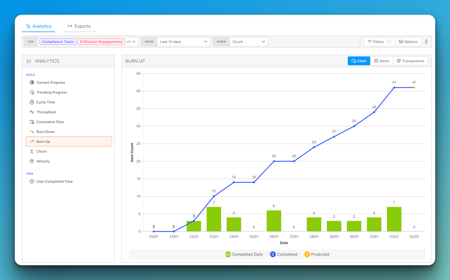
Reading the projection
The Burn Up chart's projected line uses the same rule as the Burn Down report: a rate per elapsed calendar day from the first period in which the chart had scope, anchored on the end of the last closed period and projected by the days from there to the end of each later period — the current one included, so the open period shows both its completed-so-far and its projected close. The idealized line starts where scope starts. Weekly periods run Monday to Sunday, and the period containing today is drawn as a partial period.