Report: Burn Down
Overview
A Burn Down chart is a visual representation that tracks the progress of a project or cycle over time.
The chart typically shows two axes: the x-axis represents time, while the y-axis represents the amount of work remaining to be done. The amount of work is usually measured in story points, which is a unit of measurement used in Agile software development to estimate the size and complexity of tasks.
As the project progresses, the Burn Down chart shows how much work remains to be done at any given time. Ideally, the chart should show a steady decrease in the amount of work remaining, indicating that the team is making progress towards their goal.
If the chart shows that the amount of work remaining is not decreasing as quickly as expected, the team can use this information to identify potential roadblocks or issues that need to be addressed.
The Burn Down chart is a valuable tool for Agile teams because it provides a clear, at-a-glance view of how the project is progressing. It helps the team to identify any issues early on, so they can make adjustments and stay on track to meet their goals.
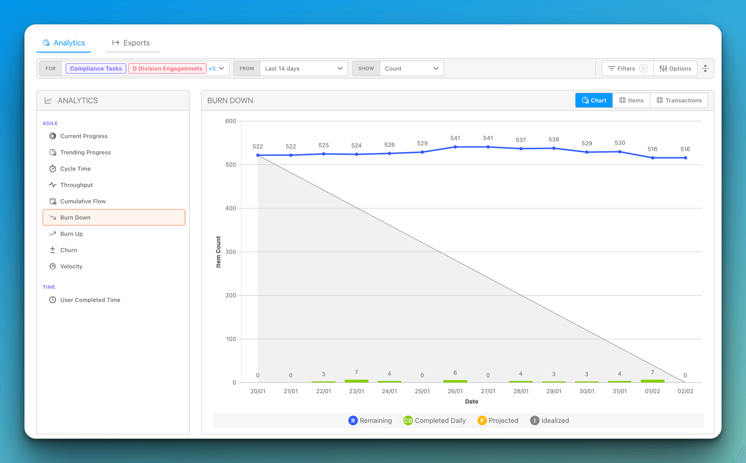
Reading the chart
The Burn Down report plots several series together so you can see both where you stand and where you are headed:
- Remaining — a line showing how much work is still left at each point in the period. Work in any completed status is excluded, not just the first one, so Remaining and the Completed bars always agree.
- Completed — bars showing work finished in each period (daily, weekly, or monthly, depending on the chart's granularity).
- Projected — a dashed trend line that extends your current pace forward to estimate where you will land. See How the projection is calculated.
- Idealized — a guideline showing the steady, even pace that would burn all the work down. It starts at the first period in which the chart had scope, not at the left edge of the range.
By default the chart measures progress by Item Count, but you can change the unit using the Show selector in the report toolbar.
How the projection is calculated
The Projected line is a rate per elapsed calendar day, not per period. DevStride finds the first period in which the chart had any scope — open work, a completion, or a rise in total scope — and divides the work completed since then by the number of days that have actually elapsed. The projection is then anchored on the end of the last closed period: from that point, each later period — the current, still-open one included — is projected by the days between the anchor and the end of that period.
Three things follow from that:
- A period you are only a few days into counts as a few days, not as a whole week or month of low progress, so the projection does not swing wildly at the start of a period.
- The current period shows both values: the Remaining line carries its actual so far, and the Projected line carries where the period is expected to close. Both fan out from the same point at the end of the previous period, so a month you are three days into no longer reads as a finished month with almost nothing done.
- Periods before your work existed are ignored entirely, so a project that gained its scope partway through the range is projected from the day it started rather than from the beginning of the range.
Scope that arrives during the open period is projected at today's pro-rata rate rather than a whole period's worth, and a burn down never projects below zero.
Both the Projected and the Idealized lines mark the end of each period, so a team burning down at exactly the ideal pace retraces the Idealized line.
Normalize Scope
By default, the Remaining line reacts to scope changes as they happen. When items are added partway through a cycle, the line goes up before it comes back down, which can make your burn rate hard to read — especially when you are comparing across multiple cycles or working with timeboxes that gain work mid-stream.
The Normalize Scope toggle smooths this out. When it is on, DevStride treats all the work that ever entered the period as if it were present from day one. The total scope is calculated as everything that was completed during the period plus everything still remaining at the end, so the Remaining line starts at the full scope and only ever decreases as work is completed. In other words, normalization front-loads all scope additions to the start of the period, giving you a cleaner picture of your team's actual burn rate.
The Projected trend line follows the normalized Remaining line, so your projection reflects the same front-loaded view while it is turned on. The Completed bars and the Idealized guideline are unaffected.
Turning Normalize Scope on or off
- Open the Burn Down report.
- Open the report's Options panel.
- Under the Data section, toggle Normalize Scope on or off.
Normalize Scope is off by default, and it is available only on the Burn Down report — other analytics reports do not show it.
When the toggle is on, a Normalize pill appears in the report toolbar. You can click the pill to clear it, which turns the toggle back off.
Anyone who can view the Burn Down report can use the Normalize Scope toggle — there are no extra roles or permissions required.