Track and Move Work with Board Views
What this page covers
"Tracking" on a board is reading it — who has what, what is overdue, what is stuck. "Moving" is changing an item by dragging it: to another status, rank, assignee or cell. Both work the same on perpetual and cycle boards. This page goes view by view; for choosing a view, see Understanding board views.
Open a board from its card's GO button in Plan Delivery, or from an item's Cycle / Board field.
The control ribbon
Left to right, in every view:
| Control | What it does |
|---|---|
| View switcher | Card view, Table view, 2D view. |
| Group by (Card and Table view) | Splits the board into groups by a field: swimlanes in Card view, grouped rows in Table view. See Group the board into swimlanes. |
| Find | Text search across the board's items. |
| Views | Saved views. Save as View stores the current filters and layout under a name, Visible only to you or Visible to coworkers. Each saved view has Copy link, Edit view and Delete view. Views are per board. |
| Filters | Assignee, Creator, Due Date (with an overdue option), Start Date, Completion Date, Item Type, Parent, Priority, Tag, Team, Time Spent, Watchers, Persona, custom Fields, and Status (Table and 2D only — in Card view the columns already are statuses). Active filters show as pills. |
| Options | Always Include Archived. Card view adds Hidden Fields; Table view adds Hide Subtasks, Line Wrap, Show Hierarchy and Table columns. While the board is grouped, Card and Table view add Show Empty Groups. |
| Export | Export Items to CSV for the board, with a Find box and a select-all checkbox for columns. Needs report access. |
Top right: Edit (appears when items are selected — the bulk menu), Import, and Item (i) to create an item on the board. Ctrl/Cmd + Shift + F collapses the ribbon to a Toolbar button.
There is no Sort button: sort from the icon in a Card-view column header, or from a column header in Table view. Both open Sort & Rank — Sort is a temporary order only you see; Rank rewrites the shared order for everyone.
Card view
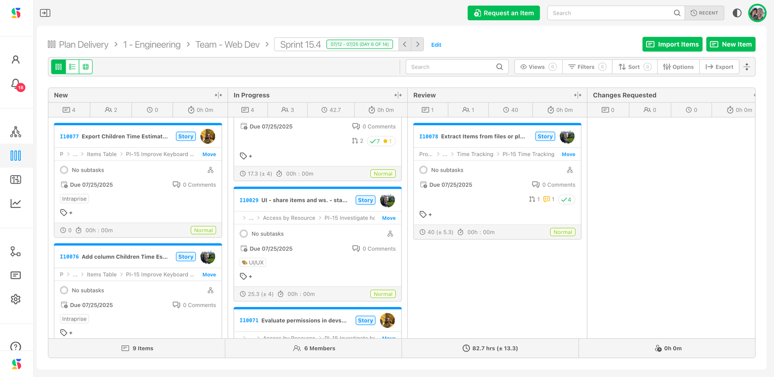
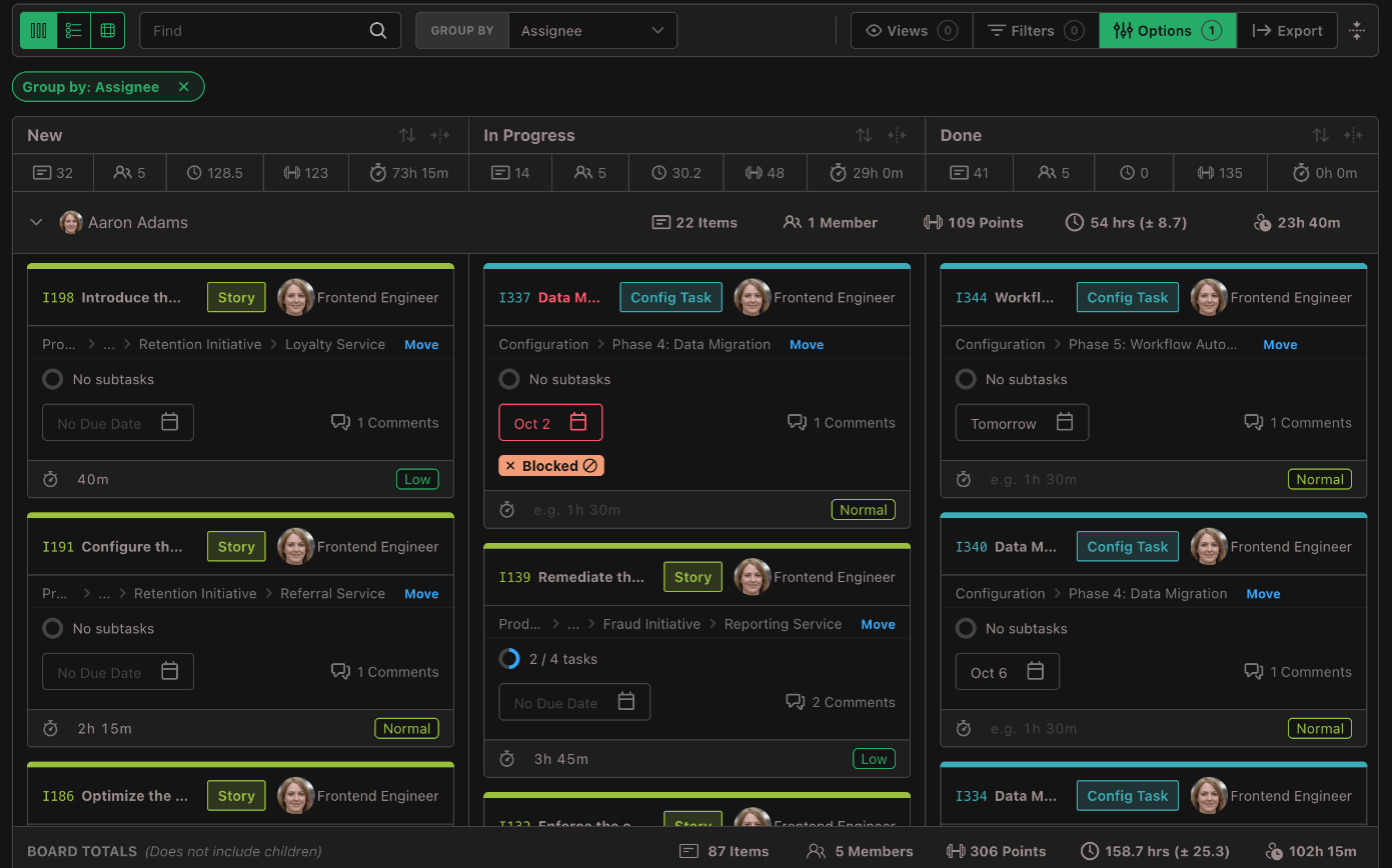
Columns are the statuses of the board's status collection. A card shows its number, title, type badge, assignee avatar (click to reassign), parent path, due date, comment count, tags, points, time estimate, time spent and priority; hide any of these under Options → Hidden Fields. Overdue titles and dates are red.
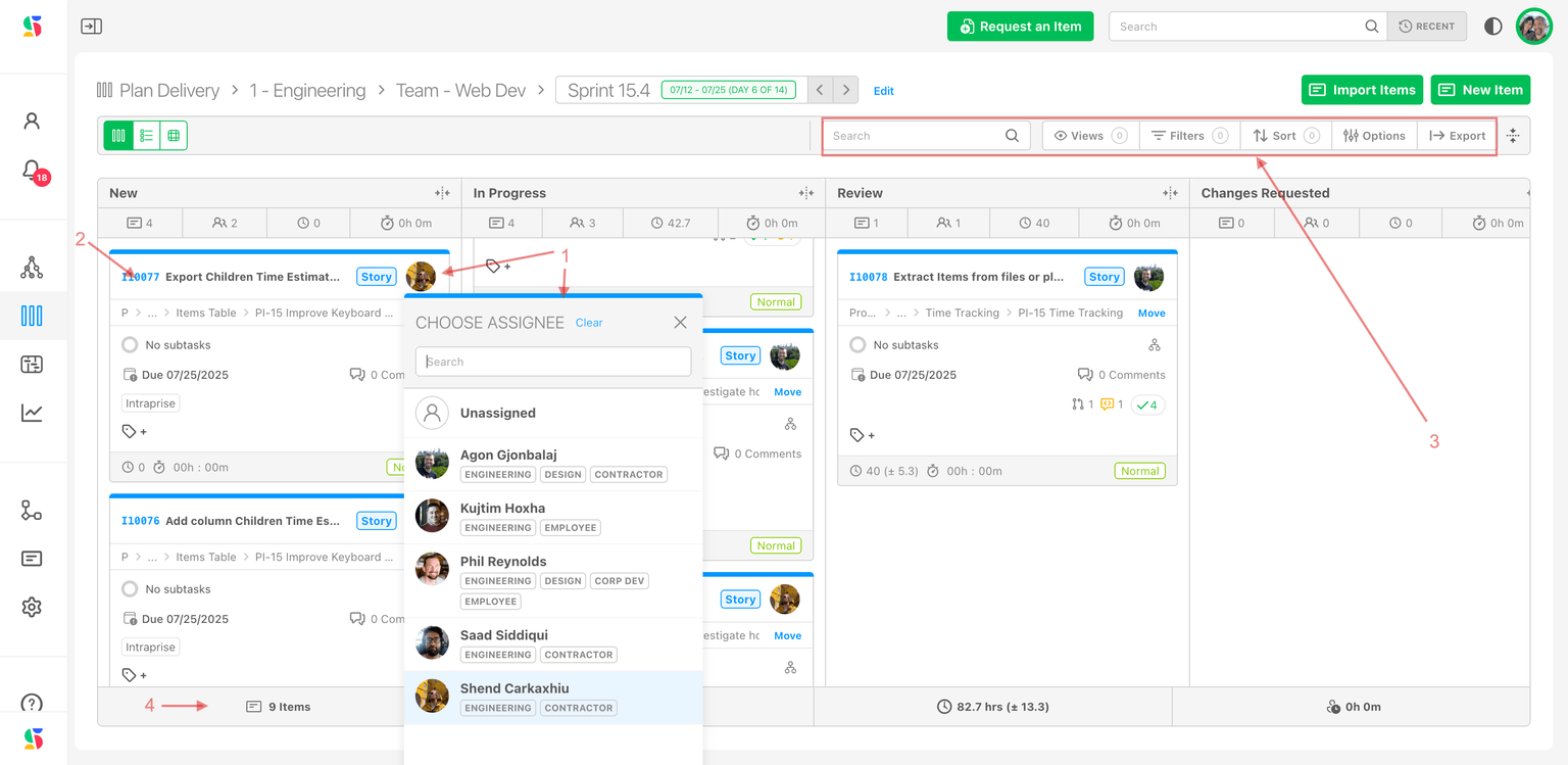
- Change status: drag the card to another column. If the status only accepts certain item types, an incompatible card cannot be dropped there. Dropping on Done while the item still has unfinished subtasks or children asks you to confirm.
- Reorder: drag within a column — this works when the column is sorted by Rank; under any other sort the card snaps back. Or right-click a card for Move to Top / Move to Bottom (disabled when it would change nothing, and only offered for items you can edit).
- Open: click a card to open its drawer and edit anything else.
- Changes made elsewhere — the drawer, Manage Items, the Gantt, an automation — move cards immediately.
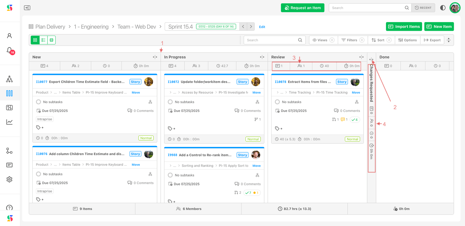
Columns can be resized by dragging their edge (double-click resets) or collapsed to a strip (1–4); both keep showing the status subtotals: Item Total, Assignee Total, Total Time Estimate, Total Point Estimate and Total Time Spent. Widths and collapsed state are remembered per board. Long columns offer Load more at the bottom.
Group the board into swimlanes
Pick a field in Group by and the board becomes swimlanes: one row per value, running across every status column. Choose None to go back to plain columns. The grouping is one choice per board, shared by Card and Table view; see Group the table for the table.
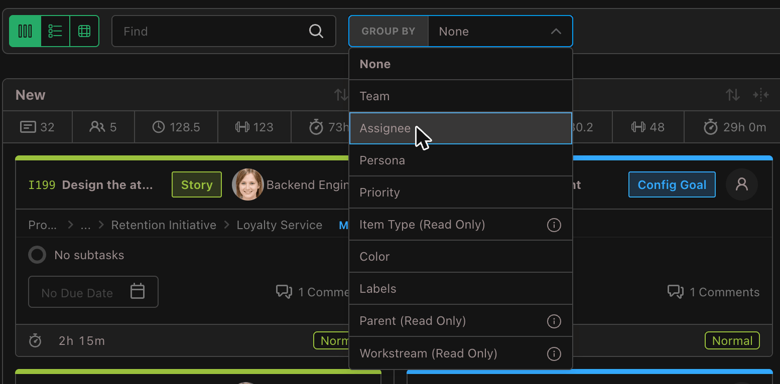
| Group by | Drag a card (or a table row) into another group? |
|---|---|
| Team, Assignee, Persona, Priority, Color | Yes — sets that field. Dropping into No team clears the team; a priority must belong to the card's own priority collection, and a deactivated member or an archived persona cannot be chosen (the same rules as the 2D view). |
| Labels | Yes — swaps the label the card came from for the one it lands on, keeping its others; dropping into No labels clears them all. A card with several labels shows in each of their swimlanes. |
| Item Type, Parent, Workstream | No — read only; each swimlane heading says so. |
- Headings. Each swimlane heading shows the same totals as Board Totals: Items, Members, Points and Time Estimate (each when the board uses it) and Time Spent, each in its own column at the right edge so they line up down the board. A total with no value in one swimlane is left blank there, and a total that no swimlane in the view has gets no column at all: when every swimlane carries only an item count, the count sits at the right edge on its own. Click the heading's arrow to collapse or expand it; collapsed swimlanes are remembered per board, and a group collapsed in one view is collapsed in the other.
- Paging. Each cell — one status in one swimlane — shows ten cards and its own Load more, so a large team or label never loads the whole board at once. Only the swimlanes on or near the screen draw their cards, and the rest fill in as you scroll to them, so a board grouped into hundreds of swimlanes stays fast. Cards you open with Load more stay open when a swimlane scrolls away and back; changing the filters or the grouping starts every cell again from its first ten, and re-sorting a column does the same for that column.
- Scrolling. The status headers stay pinned at the top while the swimlanes scroll.
- Empty groups. Hidden by default; switch on Options → Show Empty Groups to see every value, for example every team. Its pill opens Options.
- Keyboard. With nothing focused, an arrow key lands on the first heading (
↑on the last);↑and↓move between headings. On a heading,-or←collapses it and=,+or→expands it.Shift+-collapses every swimlane andShift+=expands them all. - Remembered. The grouping and the switch are remembered per board, show as a Group by pill, and are saved with a View from either view. Opening a saved Table view that has no grouping also clears the Card view's grouping.
- Live. Edit a card anywhere and it moves to its new swimlane; counts and totals follow.
Board Totals
The footer, Board Totals (Does not include children), sums the board in Card and Table views: Items, Members, Points (when an item type on the board uses points), Time Estimate and Time Spent. Click a total for an itemized breakdown — Items on this board, Members contributing, or Points / Time estimate / Time spent by item, largest first. Click an item number to open it. Totals respect the active filters; with an assignee filter plus subtasks included, the footer turns purple to flag that it counts only that assignee's work.
Table view
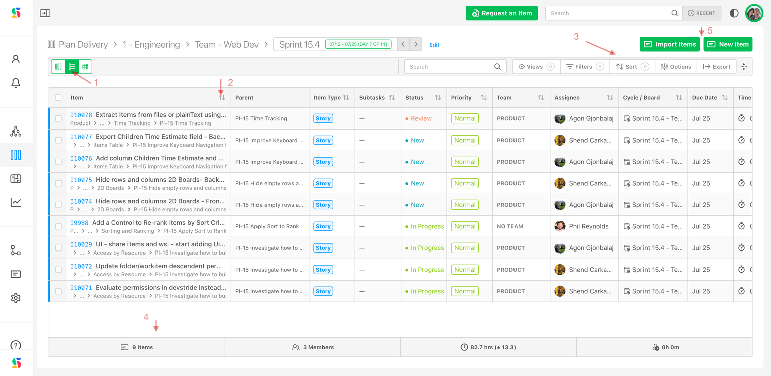
A spreadsheet of the board's items (1–5). Columns include Item, Parent, Item Type, Status, Priority, Team, Assignee, Cycle / Board, Start Date, Due Date, Point Estimate, Time Estimate, Time Spent, Tags, Watchers, Relationships, Blocked Reason, Creator, Date Added and every custom field; choose them under Options → Table columns. Most cells edit in place, and the keyboard moves you through rows and cells.
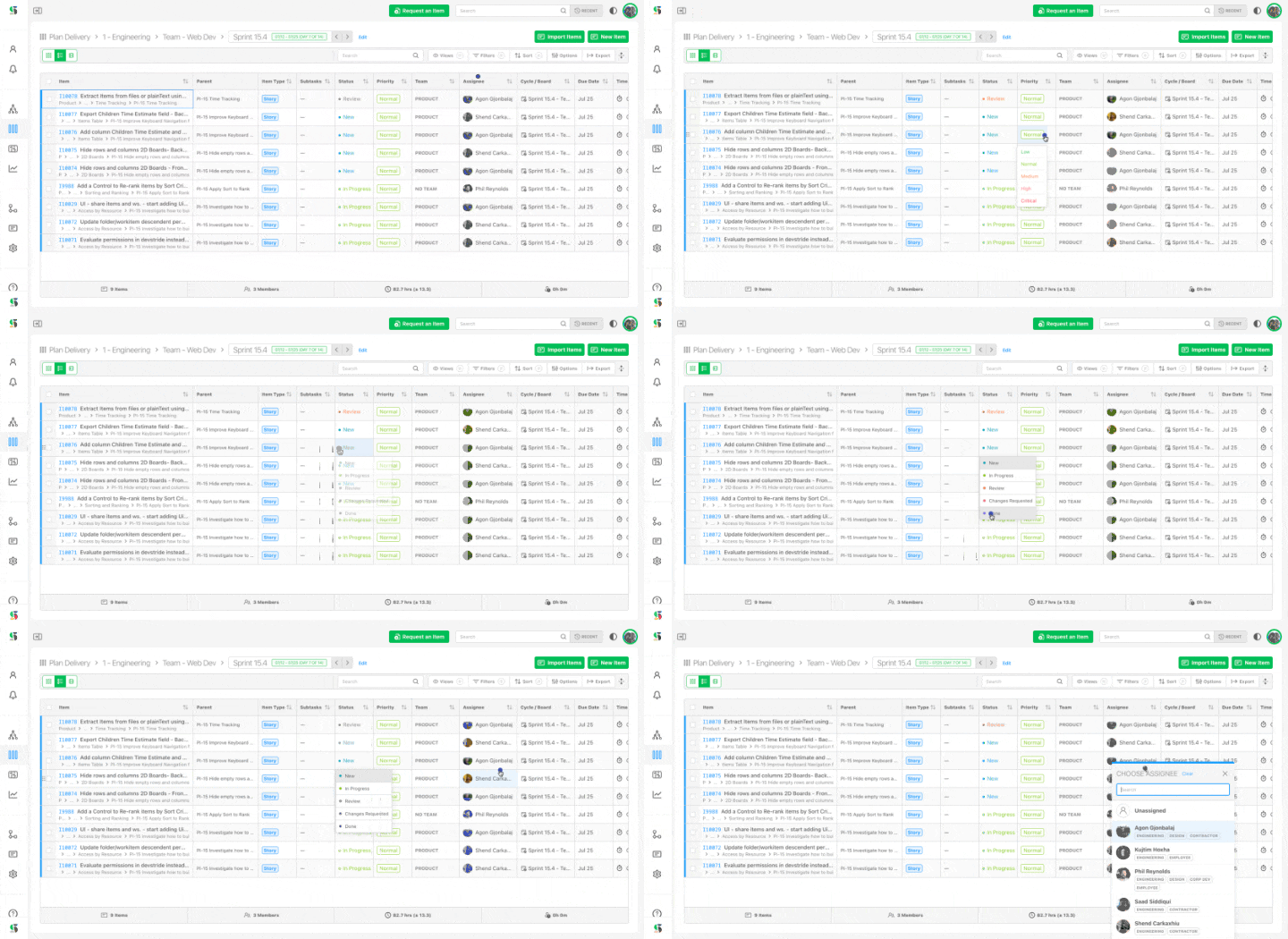
- Rank: under the default sort, drag one or several selected rows to set the board's rank. With Show hierarchy on, top-level rows still rank on the board, and a child row ranks among the other children of its parent, in the same order the Map shows them. Dropping a child on a sibling's open children places it beside that sibling. A drag never moves a row to a different parent; to do that, use the Map.
- Bulk edit: select rows and click Edit for Cycle/Board, Gantt, Team, Item Type, Relationships, Priority, Color, Location, Assignee, Point Estimate, Time Estimate, Start Date, Due Date, Status, Custom Fields, Tag, Archive and Delete.
- Right-click a row for Open, Open in New Tab, Edit, Copy (link, title, number), Duplicate, Apply Template…, Save as Template… and more.
Group the table
Group by works in the Table view too, with the same fields and the same drag rules as the Card view: the table splits into groups, each under a heading like a swimlane's, with the same totals.
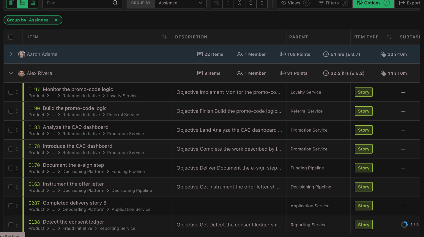
- Rows. Each group lists its rows in the table's own sort and shows its first 25, with its own Load more. Rows are ordinary table rows: edit in place, open subtasks, select and right-click as usual. Editing a row's grouped field moves it to its new group at once.
- Drag. Under the default (rank) sort, drag a row into another group to set that field, as in the Card view. Dropping a row on a group's heading, or on an empty group, moves it into that group.
- Keyboard.
↑and↓stop on each group's heading, as on a parent row in the hierarchy, and keep your column across it. On a heading,-or←collapses the group and=,+or→expands it.-on a row's Item cell collapses that row's group.Shift+-collapses every group andShift+=expands them all; the four expand/collapse buttons in the filter bar act on groups too. - Hierarchy and Rank. A grouped table is flat, so Show Hierarchy and Rank are unavailable while it is grouped; each says why. Set Group by to None to get them back.
View hierarchy in the Table view
Turn on Show hierarchy (the tree icon in the filter bar, or Options → Show Hierarchy) to nest items under their parents. When it is on you also get:
- Duplicates — how an item that matches both as a top-level row and as a descendant appears: Show Duplicates as Child Rows Only, Show Duplicates as Primary Row Only or Show Duplicates in Both Locations.
- Expand/collapse buttons: Collapse row one level, Collapse all one level, Expand all one level, Expand row one level.
- Show Matching Children Only (in Options) to keep expanded children within the current filters.
Defaults: hierarchy off, duplicates as children only, matching-children-only off. Each board remembers its own settings. Top-level rows are the board's items, but expanding a row can reveal children that live on other boards unless Show Matching Children Only is on. Hierarchy is a Table-view feature; it does not change the columns of the Card or 2D views. Full behaviour: Working with hierarchy.
2D view
A matrix with one field on each axis. Pick them from the Rows and Columns selectors in the ribbon; the swap icon between them exchanges the axes.
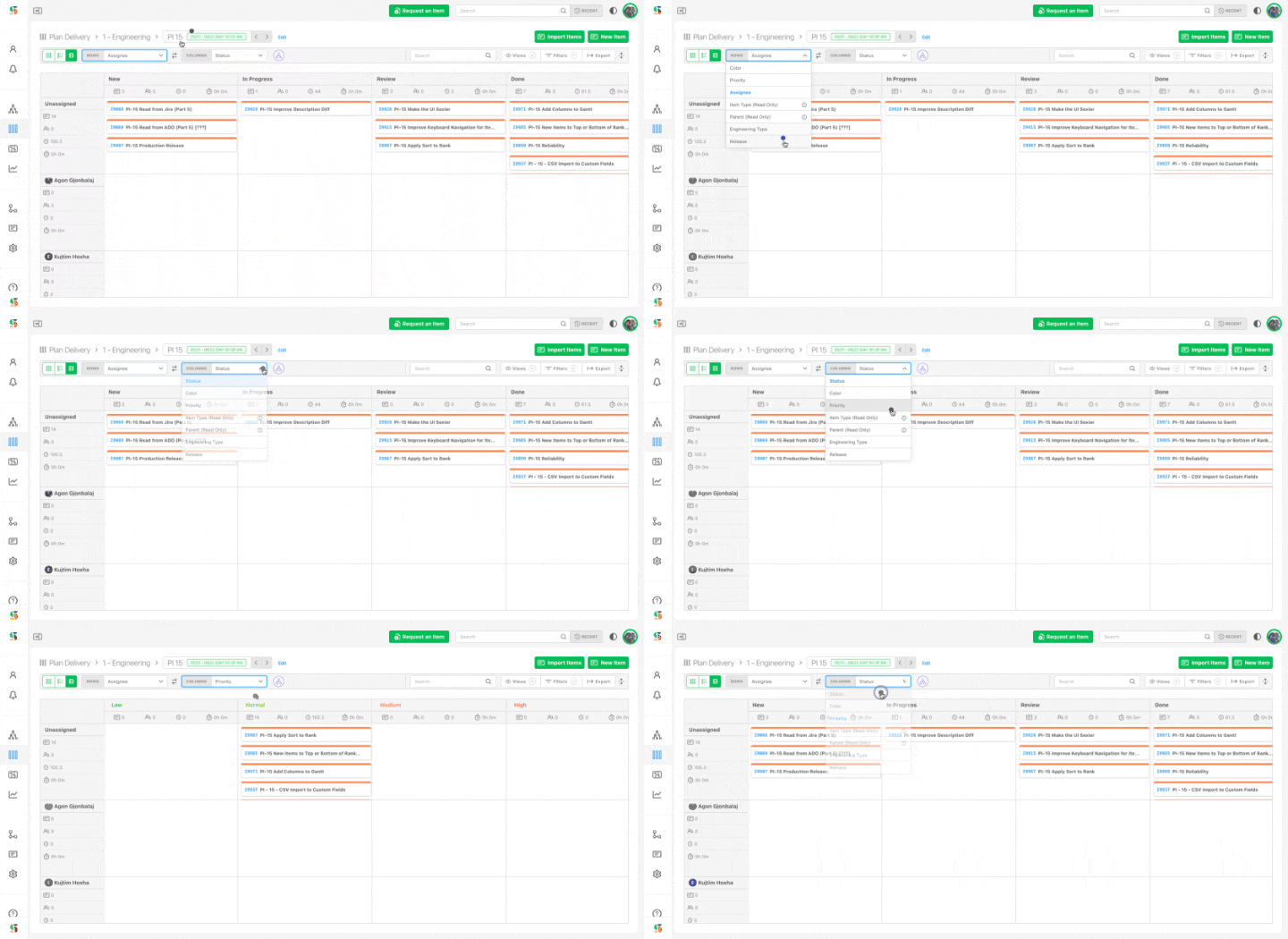
| Axis option | Drag between cells? |
|---|---|
| Status (default columns) | Yes — changes status, with the same Done confirmation as Card view. |
| Assignee (default rows) | Yes — the No person row holds unassigned items; drag into a person's row to assign. |
| Priority, Color | Yes. |
| Persona | Yes, when your organization uses Personas. |
| Team | Yes — the No team lane holds items without a team. A Team filter narrows the lanes to the teams it selects. |
| Labels | Yes — a card with several labels appears in each label's lane; dragging it swaps that one label, and dropping it on No labels clears them all. |
| Item Type (Read Only), Parent (Read Only), Workstream (Read Only) | No — for viewing only. Items outside any workstream sit in a No workstream lane. |
| Custom fields | Yes/no and single-select choice fields only. |
Row and column headers carry the same subtotals as Card-view columns. Overdue items stay red, so an overloaded, late row stands out at once. A saved View keeps both axes and the toggles below; a View naming an axis the board no longer offers (a deleted custom field, say) is flagged when it opens.
External dependencies and lines
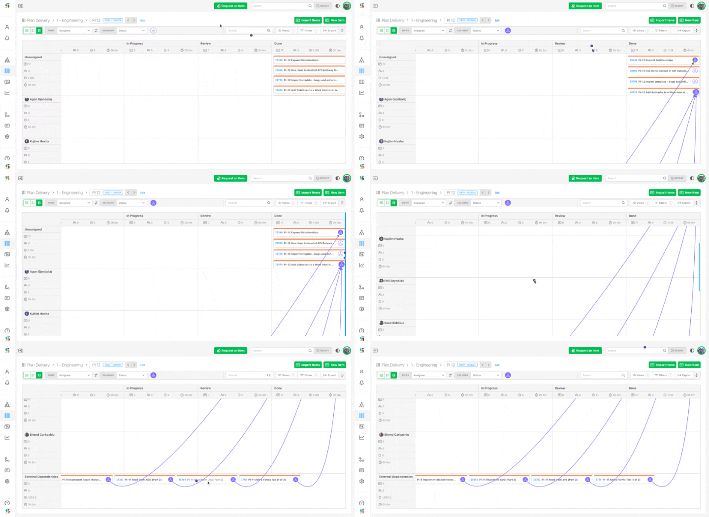
Relationships are drawn as lines between cards (solid arrow = blocked by, dashed = related). Items on other boards that block, are blocked by, or relate to your items appear in an External Dependencies row at the bottom with their lines drawn in — the "gutter lane". Toggle lines with Show or hide dependencies. See Manage and edit dependencies.
Hide empty rows and columns
An axis such as Priority or Assignee often produces cells with nothing in them. Two toggles sit beside the selectors — Hide empty rows right of Rows, Hide empty columns right of Columns. Each is independent and off by default; when on, it appears as a removable pill in the applied-view bar and is saved with a View.
WIP warnings and parent rollup
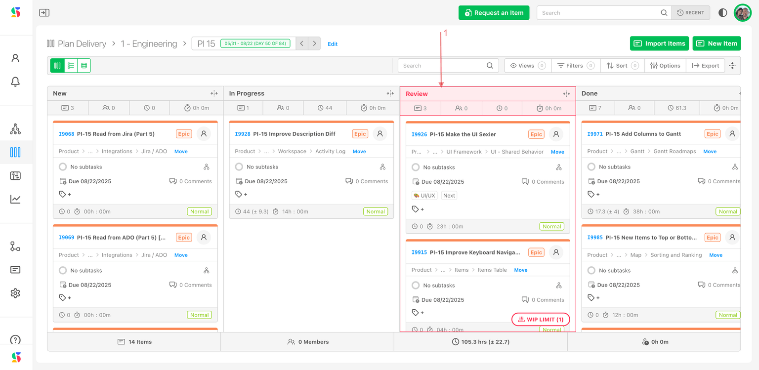
- WIP limits. When a Card-view column holds more items than its status's WIP limit, the column turns red and shows a WIP LIMIT (n) pill. It is a warning, not a block — you can still drop cards there. Limits are set per status in Configure Settings → Data Model → Item Statuses; see Boards and WIP limiters.
- Parent rollup. With the organization setting Automate New/Done on, finishing the last child moves the parent to Done, and reopening a child reopens a Done parent — wherever the parent lives. Moving cards on a board therefore updates parents on other boards too.
Jump to a board from an item
Open any item's drawer and look at the Cycle / Board field in the right sidebar. The word matching the item's board is bold — Cycle for a cycle board, Board for a perpetual one. Click the green Go button to open that board; Clear removes the item from it.
Using Cycle Boards
Set up a folder on a cadence so DevStride generates a cycle board per sprint, PI or month; plan work into a cycle, run it, and move unfinished work forward.
Boards and WIP Limiters
Set a work-in-progress limit per status so a board column turns red when the team takes on too much — what the limit does, what it doesn't, and how to set one.