Custom Fields
Custom fields capture the information your items need that DevStride does not have a built-in field for: a customer name, a release version, a cost estimate, a risk rating. You define a field once, place it in a collection, and assign the collection to the item types whose items should carry it. Fields then appear in the item drawer, as table columns, in filters and exports, on request forms, and in automations.
Where to find it
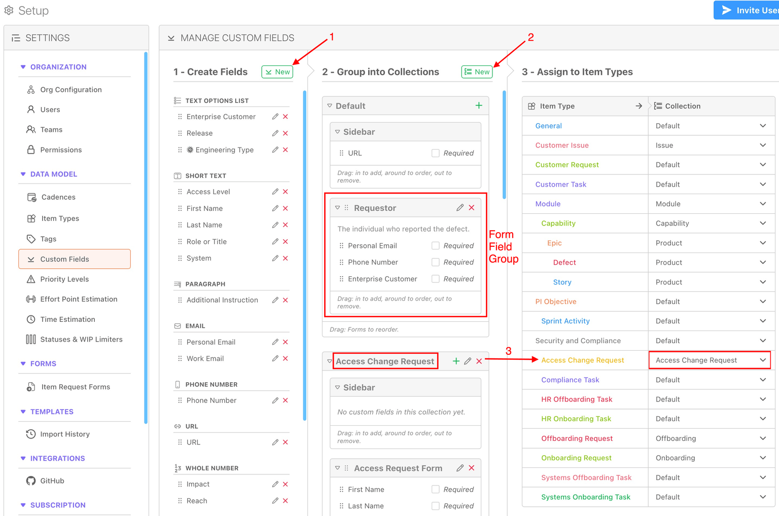
Configure Settings → Data Model → Custom Fields. The page needs the Manage fields permission (default Owner and Admin roles). Like the other Data Model pages it works in three columns, left to right.
1 - Create Fields
Click New, choose a field type, then give the field a Name and optional Description. The type cannot be changed after the field is created. Every field goes into the organization-wide pool, grouped by type, where any collection can use it.
| Type | What it stores | Options |
|---|---|---|
| Text Options List | One or more choices from a list of text values | Field Values list, Allow multiple selections, CSV import |
| Number Options List | One or more choices from a list of numbers | Same, values must be numeric |
| Multiple Checkboxes | Any number of choices from a list, shown as tick-boxes | Field Values list, CSV import; always allows several |
| Short Text | A single line | Min Length / Max Length |
| Paragraph | Multi-line text | Min Length / Max Length |
| Email, Phone Number, URL | Validated single values | — |
| Whole Number, Decimal Number | Numbers | Min Value, Max Value, Step |
| Percent | 0 to 100 | — |
| Single Checkbox, Switch | True / false | — |
| Date Picker, Date Time Picker | A date, or a date and time | Track overdue flags items whose date has passed |
| User Picker | One or more members | Allow multiple user selections; limit the options by Manually select user options or User options by group (Teams, Roles, User Labels) |
| Asset Upload | One or more files | Allow multiple file uploads, Allowed File Types |
| Calculated (Number / Text / Date / Boolean) | A value computed from other fields on the item | Formula |
Options-type fields
Add choices one at a time in Add a new option, drag them to reorder, and edit or delete them at any time. To add many at once, click Import CSV beneath the input:
- In Import Options, click Choose a file or drag and drop here and pick a
.csvfile. - Review the preview: each value is marked New or Duplicate (already in the list).
- Click Import. Only New values are added.
Values may be separated by commas, semicolons, tabs or new lines; whitespace is trimmed and blanks dropped. For a Number Options List every value must parse as a number or the import is blocked. The import is a one-time paste into the open dialog, not a live link to the file, and you still have to Save the field.
Multiple Checkboxes stores the same thing as a Text Options List that allows multiple selections, so filters, saved views, exports and automations treat the two alike; only how people answer it differs. In the item drawer, quick add and request forms each option is a tick-box that saves as soon as it is ticked. In the items table, clicking the cell opens the tick-box list with a Save button. On the support portal, customers see the ticked options as text. It is the field to use for a checklist such as a new-hire request (Laptop, Badge, Email account).
Calculated fields
A calculated field has a Formula that references other fields on the item and is recomputed when they change. People cannot type into it, and a required calculated field is filled from its formula after the item is created, so request-form submitters never have to answer it.
To use the item's status in a formula, insert Status from the formula editor; it is written as ${itemStatus}, which always means the item's status. Formulas saved earlier with the old ${itemLane} have already been converted to ${itemStatus}, and a formula that still uses ${itemLane} is refused when you save it, with a message naming ${itemStatus} instead. If you have a custom field of your own named Status, it is offered as ${itemStatusField}; a custom field of your own named Lane keeps ${itemLane}, which then means that field.
2 - Group into Collections
Click New to create a Field Collection, then drag fields from the pool into it; drag within to order, drag out to remove. In a long list, hold the item on the band at the top or bottom edge and the list scrolls straight away.
Each collection has one or more form groups. The first group is the Sidebar group: its fields appear in the item drawer's right-hand sidebar. Click + (Add Forms in Collection) to add further groups with a Label and Description; fields placed in those groups appear on the item's Forms tab instead, and are what Item Request Forms draw from. Drag the groups to reorder them.
Tick Required on a field within a collection to make the item ask for it before a new item of an assigned type can be saved. Required fields cannot be hidden from the sidebar (see Customizing the Item Drawer).
3 - Assign to Item Types
For each item type choose the collection it uses, or None. Only then do the fields show up on items of that type. Changing a type's collection needs the Manage work types permission as well.
What happens to existing items
Changing what a collection holds, or which collection an item type uses, updates every existing item of the affected types in the background:
- Removing a field from a collection, or moving an item type to a collection without it, clears that field's value from those items.
- Adding a Boolean field gives every item that has no value for it yet the value No; adding a Calculated field fills in its computed value.
- Changing a Calculated field's formula recalculates it on every item.
These updates are recorded in each item's Activity as history, but they send no notifications and do not trigger automations, so watchers are not emailed for every item in a large collection. An item that already holds a value for a field you add keeps it.
If your organization uses Service Desk, the same menu offers Customer visibility: per item type, decide for each field whether customers on the support portal see it — Agents only (the default), Customers can view, or Customers can edit. The same field can be visible on one ticket type and hidden on another.
Where custom fields appear
- The item drawer sidebar (Sidebar group) or Forms tab (other groups); individual fields can be promoted to their own sidebar pill or reordered per item type.
- Table columns, filters and sorts in Items, My Work and board table views, and one column per field in CSV exports.
- Item request forms and item templates.
- Automations, as conditions and actions, and the Custom fields modified notification.