- 02 Feb 2024
- 1 Minute to read
- Contributors

- Print
- DarkLight
What is Burn Down?
- Updated on 02 Feb 2024
- 1 Minute to read
- Contributors

- Print
- DarkLight
Overview
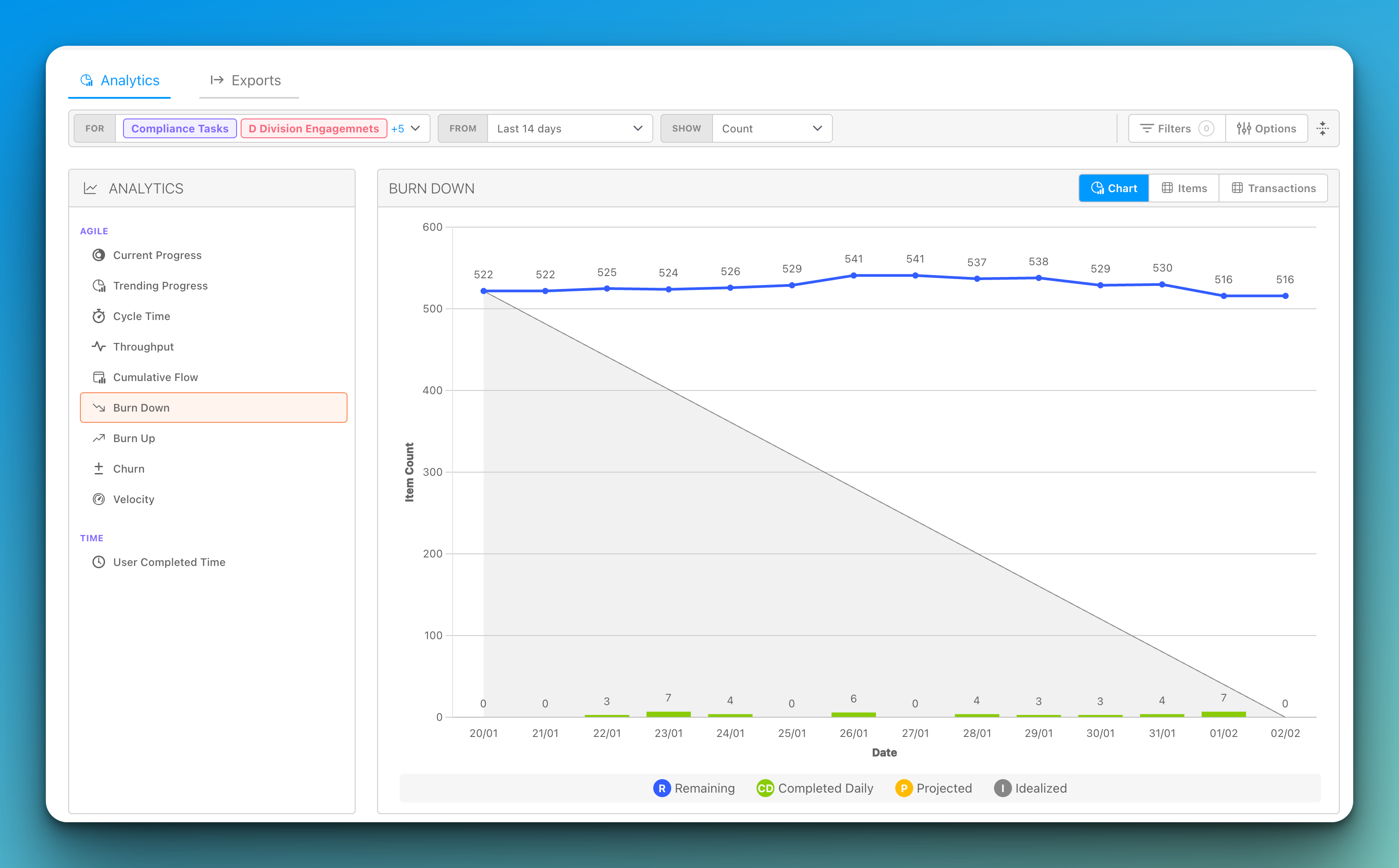
A Burn Down chart is a visual representation that tracks the progress of a project or cycle over time.
The chart typically shows two axes: the x-axis represents time, while the y-axis represents the amount of work remaining to be done. The amount of work is usually measured in story points, which is a unit of measurement used in Agile software development to estimate the size and complexity of tasks.
As the project progresses, the Burn Down chart shows how much work remains to be done at any given time. Ideally, the chart should show a steady decrease in the amount of work remaining, indicating that the team is making progress towards their goal.
If the chart shows that the amount of work remaining is not decreasing as quickly as expected, the team can use this information to identify potential roadblocks or issues that need to be addressed.
The Burn Down chart is a valuable tool for Agile teams because it provides a clear, at-a-glance view of how the project is progressing. It helps the team to identify any issues early on, so they can make adjustments and stay on track to meet their goals.


